This is a project given from an online data science competition to predict the number of dengue cases each week (in each location) based on environmental variables describing changes in temperature, precipitation, vegetation, and more. The assignment task is to create a polished report that includes several sections including problem overview, data preperation, exploratory data analysis, statistical modeling and interpretation.
Problem Overview
Introduction of Dengue Virus
The dengue virus is spread by the two types of mosquitoes, Aedes aegypti and Aedes albopictus. These mosquitos are associated with four serotypes and three type of diseases: dengue Fever (DF), dengue hemorrhagic fever (DHF), and dengue shock syndrome (DSS) [1]. The infection of one serotype does not provide any protection against the others and the accumulation of more serotypes results in a higher chance of more severe dengue symptoms. Today, 2.5 billion people or about 40% of the world’s population live in the area where there is a risk of dengue transmission. The World Health Organization (WHO) estimates that about 50 to 100 million yearly infections with 500,000 DHF cases and 22,000 deaths.
 Number of suspected or laboratory-confirmed dengue cases notified to WHO, 1990–2015 [12]
The transmission of the virus can usually only occur from humans to mosquitos or mosquitos to humans. In rare cases, dengue virus can also be transmitted by blood transfusions and organ transplants of infected donors or an infected pregnant mother to her fetus. For the transmission to occur from a mosquito to a human, the mosquito has to feed on a person during a 5 day period when large amounts of virus in the blood. The symptoms of infection occur 4 - 7 days after the mosquito bite and last 3 - 10 days. If the dengue virus enters the mosquito in a blood meal, it requires 8 - 12 days of incubation for the virus to be transmitted to another human. Once the mosquito has been infected with the dengue virus, it remains infected for the remainder of its life (days to weeks) [2].
Vectors for Dengue Virus
The female mosquitos that are vectors for the dengue virus require environments with stagnant water, due to the stable environment it offers [1]. The mosquitos can lay about 100-200 eggs per batch, producing up to 5 batches in the life cycle. They are often laid on damp surfaces that are likely to flood. When the water level rises due to rain or other causes, the larvae hatch from their eggs. But even without moisture these eggs can live up to several months, hatching when the eggs are flooded with water [2]. The life-cycle of these mosquitos have an aquatic phase and a terrestrial phase. In the terrestrial phase, when the mosquito reaches adulthood, its life-cycle can range from 2 weeks to a month depending on environmental conditions [3].
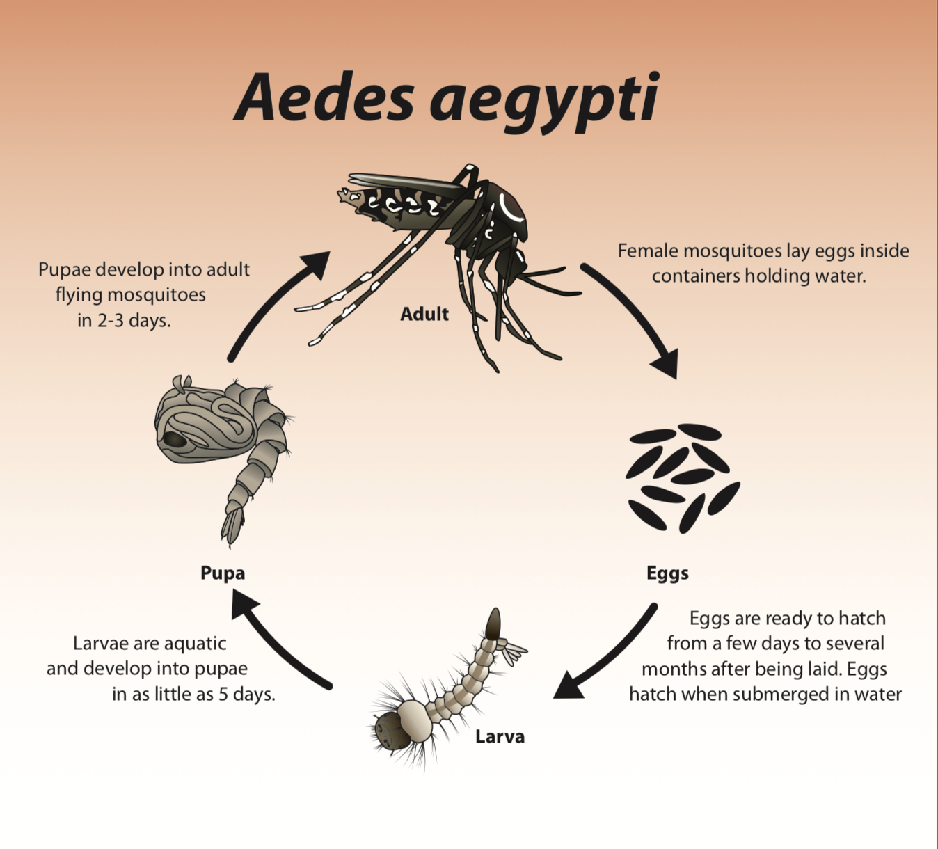 Life Cycle of Aedes aegypti, the main vector for the dengue virus [10]
These mosquitos are highly sensitive to environmental conditions including the temperature, precipitation, and humidity. Weather conditions are often correlated with dengue incidents. Other studies have used different models including temperature, precipatation and humidity to predict other diseases such as malaria and zika [5][6]. Higher temperature environments can reduce the time required for the virus to replicate in a mosquito, resulting in greater chances for the mosquito to infect a human before it dies [2]. Precipitation results in flooded water, increasing the number of available vectors for the dengue virus. Humidity provides moisture and is a better condition that is associated with mosquito survival [4]. The normalized difference vegetation index (NDVI) has also previously been a popular feature used in studies to predict viruses and can provide some data about the urban structure and environmental factors of a given location [7][8][9]. These conditions are the features that have been given to us in the competition. We believe that they will be important in predicting the cases of the dengue virus.
Environmental Conditions and Data set
The datasets we have been given are from DRIVENDATA for the DengAI competition. They include the total cases of reported dengue virus in two cities San Juan (capital of Puerto Rico) and Iquitos (capital of Peru) by the week of the year from 1990-2010. The training set includes data that spans for 18 and 10 years, respectively. The data for the cities span over different years, 1990-2008 for San Juan and 2000-2010 for Iquitos. The training data also includes environmental factors from a few sources including the temperature, humidity, precipitation, and vegetation in these cities during the time of the reported cases. The dataset seems to be organized consecutively by weekofyear. Due to the fact that the mosquitos are environmentally sensitive, we will likely be investigating the climate related variables to find favorable conditions that result in propagating the vectors for the dengue virus.
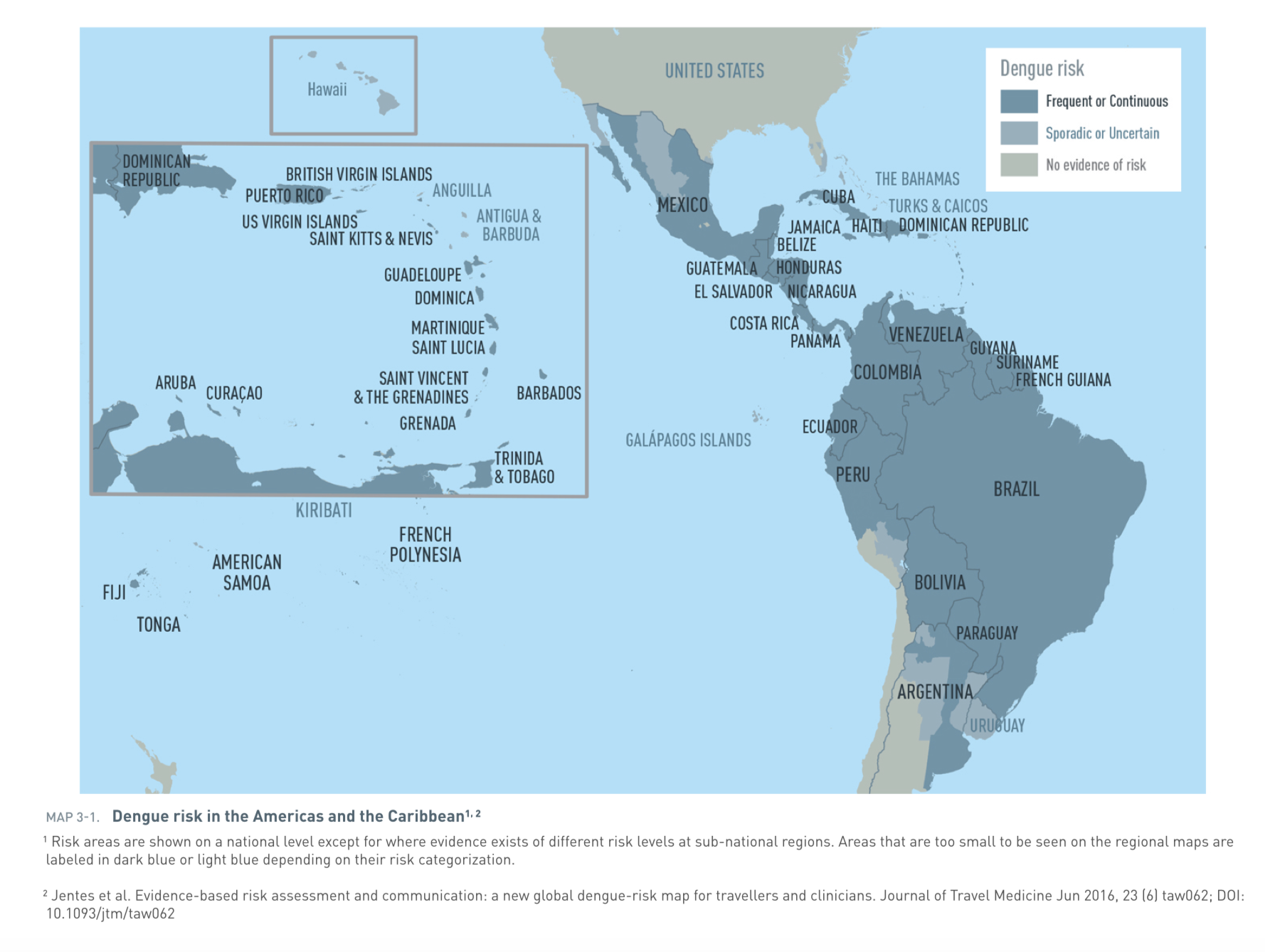 Prevalence of dengue in the Americas and the Caribbean [11]
From the research we have gathered, we can assume that there is some time lag between when the virus has infected the people and when these cases get reported [2]. Symptoms do not usually occur immediately after the infection of dengue virus. A limitation to the dataset is the fact that these are reported cases of dengue virus. There seems to be asymptomatic cases of the virus, which may not be reflected in these numbers.
Works Cited
[1] Ahmad, Shahbaz, et al. “Surveillance of Intensity Level and Geographical Spreading of Dengue Outbreak among Males and Females in Punjab, Pakistan: A Case Study of 2011.” Journal of Infection and Public Health, vol. 11, no. 4, Aug. 2018, pp. 472–85. PubMed, doi:10.1016/j.jiph.2017.10.002.
[2] Epidemiology | Dengue | CDC. https://www.cdc.gov/dengue/epidemiology/index.html. Accessed 13 Nov. 2018.
[3] Administrator. Life Cycle of Dengue Mosquito Aedes Aegypti. http://www.denguevirusnet.com/life-cycle-of-aedes-aegypti.html. Accessed 13 Nov. 2018.
[4] Campbell, Karen M., et al. “The Complex Relationship between Weather and Dengue Virus Transmission in Thailand.” The American Journal of Tropical Medicine and Hygiene, vol. 89, no. 6, Dec. 2013, pp. 1066–80. PubMed Central, doi:10.4269/ajtmh.13-0321.
[5] Teklehaimanot, Hailay D., et al. “Weather-Based Prediction of Plasmodium Falciparum Malaria in Epidemic-Prone Regions of Ethiopia I. Patterns of Lagged Weather Effects Reflect Biological Mechanisms.” Malaria Journal, vol. 3, no. 1, Nov. 2004, p. 41. BioMed Central, doi:10.1186/1475-2875-3-41.
[6] Suparit, Parinya, et al. “A Mathematical Model for Zika Virus Transmission Dynamics with a Time-Dependent Mosquito Biting Rate.” Theoretical Biology and Medical Modelling, vol. 15, no. 1, Aug. 2018, p. 11. BioMed Central, doi:10.1186/s12976-018-0083-z.
[7] Troyo, Adriana, et al. “Urban Structure and Dengue Fever in Puntarenas, Costa Rica.” Singapore Journal of Tropical Geography, vol. 30, no. 2, July 2009, pp. 265–82. PubMed Central, doi:10.1111/j.1467-9493.2009.00367.x.
[8] Qi, Xiaopeng, et al. “The Effects of Socioeconomic and Environmental Factors on the Incidence of Dengue Fever in the Pearl River Delta, China, 2013.” PLOS Neglected Tropical Diseases, vol. 9, no. 10, Oct. 2015, p. e0004159. PLoS Journals, doi:10.1371/journal.pntd.0004159.
[9] Gomez-Elipe, Alberto, et al. “Forecasting Malaria Incidence Based on Monthly Case Reports and Environmental Factors in Karuzi, Burundi, 1997–2003.” Malaria Journal, vol. 6, no. 1, Sept. 2007, p. 129. BioMed Central, doi:10.1186/1475-2875-6-129.
[10] Mishra, Parinita. Evaluation of Phytochemical Compounds from Carica Papaya as Potential Drugs against Dengue Virus: An In Silico Approach. 2016.
[11] map_3-01.pdf. https://www.cdc.gov/travel-static/yellowbook/2018/map_3-01.pdf. Accessed 13 Nov. 2018.
[12] “WHO | Epidemiology.” WHO, http://www.who.int/denguecontrol/epidemiology/en/. Accessed 13 Nov. 2018.
# loads the neccesary libraries
import pandas as pd
import numpy as np
import seaborn as sns
import matplotlib
import matplotlib.pyplot as plt
from matplotlib.ticker import MaxNLocator
import statsmodels.api as sm
import statsmodels.formula.api as smf
from statsmodels.stats.outliers_influence import variance_inflation_factor
from statsmodels.tools import eval_measures
from sklearn import metrics

from sklearn.decomposition import PCA
from sklearn.preprocessing import scale

# suppresses warnings
from warnings import filterwarnings
filterwarnings('ignore')

# # setting matlap default style
# matplotlib.rcParams['figure.figsize'] = (15, 10)
matplotlib.style.use('ggplot')
# matplotlib.rcParams['figure.titlesize'] = 20

%matplotlib inline
# getting the data from the csv to dataframes
datapath = 'data/'
dft = pd.read_csv(datapath + 'dengue_features_train.csv')
dlt = pd.read_csv(datapath + 'dengue_labels_train.csv')
test_features = pd.read_csv(datapath + 'dengue_features_test.csv')
Data Preperation
The data is taken from csv files given by the DRIVENDATA DengAI competition. Let's take a look at the shape of the data.
# checking the shape of the given datasets
print('Training Features Shape:', dft.shape)
print('Training Labels Shape:', dlt.shape)
We will need to check if there are any missing values in the given datasets.
# checking null values
print('Checking number of NA in Training Features:')
dft.isna().sum()
# checking null values
print('Checking number of NA in Training Labels:')
dlt.isna().sum()
There does not seem to be any missing data in the training labels. However, there are NaN values in the given training features. The NaN values seem to be present for all columns of the training features with numeric values. NaN is most heavily present in the data given by satellite vegetation for nvdi_* and the reported climate conditions from GHCN daily climate data weather station station_*. NaN values will be problematic when performing analysis. Since we know that the null values are sequentially ordered, instead of dropping the rows, we decided to fill the null values with the previous data. We may decide to exclude the use of variables that had prevalent NaN values because it can affect the results. As stated earlier in the problem overview, there are also some variables in the dataset that are the same but come from different sources. Some variables may have very similar results and variances. We are thinking of avoiding multicollinearity by removing these variables as well.
dft.fillna(method='ffill', inplace=True)
# checking null values
print('Checking number of NA in Training Features after filling:')
dft.isna().sum()
# merge data
dft['total_cases'] = dlt['total_cases']
We have decided to create shifted total_cases because the reported cases maybe late compared to the actual mosquito bitings and infections of the people. We will find what variables result in higher correlations from the shift. Given that it takes about 8-10 days for a mosquito to enter its adult phase, an incubation time of about 8-12 days for the virus to be infectious, and another 7-10 days for dengue virus symptoms time lags will exist. There is about a 3-5 weeks difference so we will explore the results of 4 weeks of shift.
# create time lagged variable
dft['total_cases_1week'] = dft['total_cases'].shift(-1)
dft['total_cases_2week'] = dft['total_cases'].shift(-2)
dft['total_cases_3week'] = dft['total_cases'].shift(-3)
dft['total_cases_4week'] = dft['total_cases'].shift(-4)

# dropping the last row after the shift
dft = dft[:-4]
We will now look at some of the features such as the NDVI to do some preperations in the decision-making for our data.
# plotting ndvi against total cases
plt.figure(figsize=(15, 10))
sns.scatterplot(x='ndvi_ne', y='total_cases', alpha=0.7, data=dft, label='ne')
sns.scatterplot(x='ndvi_nw', y='total_cases', alpha=0.7, data=dft, label='nw')
sns.scatterplot(x='ndvi_se', y='total_cases', alpha=0.7, data=dft, label='se')
sns.scatterplot(x='ndvi_sw', y='total_cases', alpha=0.7, data=dft, label='sw')
plt.legend(fontsize=20)
plt.title('NDVI vs. Total Cases', fontsize=20)

The data seems to be very similar for NDVI across the different locations with slightly shifted values. We decided to take the average of them to prevent the extra noise and multicolinearity.
# creating avg of ndvi
dft['ndvi_avg'] = dft.loc[:, 'ndvi_ne':'ndvi_sw'].mean(axis=1)

# dropping other ndvi variables
dft = dft.drop(columns=['ndvi_ne','ndvi_nw','ndvi_se','ndvi_sw'])
Next we will be looking for which source to use for precipitation. It is an important climate variable because the mosquitos of interest need water to hatch and have better survivability in wet conditions.
# getting correlations of data
precip_cols = ['precipitation_amt_mm',
                'reanalysis_sat_precip_amt_mm',
                'station_precip_mm',
                'total_cases']
precip_corr = dft[precip_cols].corr()
# correlations matrix for training data
plt.figure(figsize=(15,10))
mask = np.zeros_like(precip_corr, dtype=np.bool)
mask[np.triu_indices_from(mask)] = True
cmap = sns.diverging_palette(220, 10, as_cmap=True)
sns.heatmap(precip_corr, mask=mask, cmap=cmap, vmax=1, vmin=-1, center=0,
         square=True, linewidths=.5, cbar_kws={"shrink": .5})
plt.title('Diagonal Correlation Matrix for Precipitation Data')

# looking at correlations of precip
precip_corr
The precipitation_amt_mm and reanalysis_sat_precip_amt_mm variables seem to be the exact same so we will only by using one of them. We are getting very different results from station_precip_mm but since reanalysis seems to give slightly better correlation values we will be dropping the station variable. The station data also had a higher number of missing values, which justifies our choice.
Other notable things include the increase in correlation with precipitation on the shifted values of our total_cases which we will explore more later on.
# dropping precipitation columns
dft = dft.drop(columns=['precipitation_amt_mm', 'station_precip_mm'])
Since we think that several environmental conditions are important we have decided to create some of our own variables that could help further improve the model.
One important aspect we wanted our model to include was the temperature range. But we might expect that temperature range would have a reversed relationship. We want smaller temperature ranges to appear with larger numbers indicating that there is a higher probability for the mosquitos to survive. We decided to create a variable that is simply dividing 100 by the temperature range in kelvins. We will call this temp_r.
$TempR =\frac{100}{ReanalysisTdtrK}$
We will also capture another factor which we will name as air_dew. This attempts to capture the deviation of the air temperature from the temperature of droplets from forming. More droplets means more water, which is possibly better for the mosquitos.
$AirDew=\frac{100}{|ReanalysisDewPointTempK-ReanalysisAirTempK|}$
# creating the new variables
dft['temp_r'] = 100 /  dft['reanalysis_tdtr_k']
dft['air_dew'] = 100 /  abs(dft['reanalysis_dew_point_temp_k'] - dft['reanalysis_air_temp_k'])
We decided to seperate the data by city because we believe they would have different environmental conditions. The data sets also seem to span through different years. When modeling them in comparison, it could be useful for finding how different values in the varaibles across different locations can affect the cases of dengue.
sj_dft = dft[dft['city'] == 'sj']
iq_dft = dft[dft['city'] == 'iq']
Exploratory Data Analaysis
We will begin by doing univariate analysis on the total_cases of dengue virus.
# plotting histograms
plt.figure(figsize=(15,10))
sns.distplot(sj_dft['total_cases'], color="red", label="San Juan", kde=False)
plt.ylabel('Counts', fontsize=20)
plt.xlabel('Total Cases', fontsize=20)
plt.title('Distribution of Total Cases in San Juan', fontsize=20)

plt.figure(figsize=(15,10))
sns.distplot(iq_dft['total_cases'], color="blue", label="Iquitos", kde=False)
plt.ylabel('Counts', fontsize=20)
plt.xlabel('Total Cases', fontsize=20)
plt.title('Distribution of Total Cases in Iquitos', fontsize=20)

Plotted above are histograms of total_cases for the city of San Juan and Iquitos. The most obvious difference between the two are the ranges, with San Juan having observations of total cases reported at and above 400 for certain weeks. Iquitos' highest value does not go above 120 total cases. This shows that San Juan has experienced outbreaks far more severe in terms of total cases than Iquitos. The variation maybe due to the seasonal climate trend that occurs with the dengue virus. We also observe similar shapes to their distributions, with larger counts of observations at lower levels, sloping off as we increase case numbers. Next we will look at some summary statistics of our case data.
# getting a summary of total cases
print('All Total Cases:\n', dft['total_cases'].describe(), '\n')
print('variance:', dft['total_cases'].var(), '\n')
print('San Juan Total Cases:\n', sj_dft['total_cases'].describe(), '\n')
print('variance:', sj_dft['total_cases'].var(), '\n')
print('Iquitos Total Cases:\n', iq_dft['total_cases'].describe(), '\n')
print('variance:', iq_dft['total_cases'].var(), '\n')
The standard deviations are much larger than the mean for the data. This indicates that there is a high variance in the reported cases of dengue virus. As discussed in the research, climate conditions may be playing a role in effecting when the dengue virus infections occur most frequently. The variation maybe due to the seasonal climate trend that occurs with the dengue virus. As dengue can be spread from by mosquitoes passing the virus between humans, outbreaks can occur when there are more people for the mosquito to spread from. This can allow outbreaks to grow very quickly, and could lead to the large variance we see.
The mean and variances are way too far off, indicating that we cannot use a poisson regression for our model. Instead, we will choose to use a negative binomial regression, which is used in the case when the mean and variance are not equal. Let's explore the data a bit more.
print('Number of weeks with zero cases in San Juan:',sum(sj_dft['total_cases']==0))
print('Number of weeks with zero cases in Iquitos:', sum(iq_dft['total_cases']==0))
We see that there is a large number of weeks where there are no cases of dengue virus in Iquitos. We may need to investigate why this is the case.
# get correlations of features
sj_corr = sj_dft.corr()
iq_corr = iq_dft.corr()
# correlations matrix for San Juan
plt.figure(figsize=(15,10))
mask = np.zeros_like(sj_corr, dtype=np.bool)
mask[np.triu_indices_from(mask)] = True
cmap = sns.diverging_palette(220, 10, as_cmap=True)
sns.heatmap(sj_corr, mask=mask, cmap=cmap, vmax=1, vmin=-1, center=0,
         square=True, linewidths=.5, cbar_kws={"shrink": .5})
plt.title('Diagonal Correlation Matrix for San Juan 1990-2008')

# correlations matrix for Iquitos
plt.figure(figsize=(15,10))
mask = np.zeros_like(iq_corr, dtype=np.bool)
mask[np.triu_indices_from(mask)] = True
cmap = sns.diverging_palette(220, 10, as_cmap=True)
sns.heatmap(iq_corr, mask=mask, cmap=cmap, vmax=1, vmin=-1, center=0,
            square=True, linewidths=.5, cbar_kws={"shrink": .5})
plt.title('Diagonal Correlation Matrix for Iquitos 2000-2010')

All variables seem to be somewhat correlated but not to a great extent. The correlation matrix shows that the shifted total_cases improves the values for Iquitos. Comparing the different total cases of the cities, we can see that it provides more consistent results for correlation signs of San Juan and Iquitos after the 3-4 week shifts of the total_cases. This shows that the shifts may have accounted for some of the time lags that occurs from the reported cases.
A lot of the variables represent the same thing. To remain consistent we have decided to drop the variabels that come from the station and keep the others from the same satelite source.
# correlations bar plot
plt.figure(figsize=(15,10))
(sj_corr
     .total_cases_4week
     .drop('total_cases')
     .drop('total_cases_1week')
     .drop('total_cases_2week')
     .drop('total_cases_3week')
     .drop('total_cases_4week')
     .sort_values(ascending=False)
     .plot
     .barh(color='C0'))
plt.title('San Juan Feature Correlations with total_cases_4week', fontsize=20)

# correlations bar plot
plt.figure(figsize=(15,10))
(iq_corr
     .total_cases_4week
     .drop('total_cases')
     .drop('total_cases_1week')
     .drop('total_cases_2week')
     .drop('total_cases_3week')
     .drop('total_cases_4week')
     .sort_values(ascending=False)
     .plot
     .barh(color='C1'))
plt.title('Iquitos Feature Correlations with total_cases_4week', fontsize=20)

None of the values are heavily correlated with the total_cases' A lot of the variables represent the same values but different sources from the satelite or station. We can see from the barchart that the station provides slightly better correlation values compared to the reanlysis temperature for certain cases. Min temperature seems to be the most correlated variable in Iquitos. This could be due to the fact that Iquitos is colder than San Juan. Such colder conditions may not be favorable for the dengue virus.
# plotting temperature range against total cases for different years
g = sns.FacetGrid(dft, col='year', hue='city', margin_titles=True, col_wrap = 7)
g = (g.map(plt.scatter, "reanalysis_tdtr_k", "total_cases", alpha=0.7).add_legend())
plt.title("Temperature Ranges by Year in San Juan and Iquitos")

The following charts show the temperature range in kelvins reanalysis_tdtr_k for different years and the number of total_cases in those years. We see that temperature range for Iquitos is consistently higher than San Juan, which maybe one of the factors contributing to lower number of dengue virus cases. A possible explanaition for the lower number of incidents of the virus in Iquitos is that the mosquito cannot survive the temperature fluctiations of the environment.
# plotting weekofyear with total cases
plt.figure(figsize=(15, 10))
sns.scatterplot(x='weekofyear', y="total_cases", hue='city', alpha=0.7, data=dft);

The charts show that there is somewhat of a trend in when the dengue cases start to increase. It tends to increase starting from week 30 of the year, most notably in San Juan. The largest observations of total cases tend to happen surrounding week 40. As discussed above, this could possibly be related to the weather at this time of year. However, this does not happen every year.
# plotting total cases against each year and the weeksofyear
g = sns.FacetGrid(dft, col='year', hue='city', margin_titles=True, col_wrap=7)
g = (g.map(plt.scatter, "weekofyear", "total_cases", alpha=0.7).add_legend())

This chart shows more specifically the years and the weekofyear for the dengue cases. If we look at the charts as a continuous line, we can see that the outbreaks stay dormant through certain periods of time before climbing back up. There is a general trend where the later half of the year has small lumps that occur before declining again in the beginning of the next year. As mosquitoes tend to die off in colder conditions, this could be a sign of the effect of winter. When the rains return, this could be a reason for the spike of cases beginning to rise, as the eggs are revived with incoming water.
# converting dates to date time
sj_dft['week_start_date'] = pd.to_datetime(sj_dft['week_start_date'])
sj_dft.set_index('week_start_date', inplace=True)
iq_dft['week_start_date'] = pd.to_datetime(iq_dft['week_start_date'])
iq_dft.set_index('week_start_date', inplace=True)
# time series plotting
plt.figure(figsize=(20,20))

# plot for total cases through time
ax1 = plt.subplot(211)
sj_dft_dated = dft[dft['city']=='sj']
iq_dft_dated = dft[dft['city']=='iq']
plt.plot(sj_dft['total_cases_4week'], linewidth=5, label='San Juan')
plt.plot(iq_dft['total_cases_4week'], linewidth=5, label='Iquitos')
plt.title('Total Cases of Dengue Virus from 1990 to 2010 in San Juan and Iquitos')
plt.xlabel('Year')
plt.ylabel('Total Cases')
plt.legend()

# plot for avg temperature through time
ax2 = plt.subplot(212)
plt.plot(sj_dft['station_avg_temp_c'], linewidth=5, label='San Juan')
plt.plot(iq_dft['station_avg_temp_c'], linewidth=5, label='Iquitos')
plt.title('Average temperature From 1990 to 2010 in San Juan and Iquitos')
plt.xlabel('Year')
plt.ylabel('Temperature (Celsius)')
plt.legend()

sum(sj_dft['year'] == 1991)
We see that there is a seasonal effect in the fluctuations of the virus, where it occurs during certain times of the year. However, there are a few peaks in the cases of dengue virus. These seem to occur most notabley in 1994 and 1998, during the years of the outbreaks of dengue. Temporal fluctuations do not seem consistent in both cities, which maybe due to the different time of the climate conditions to be better for dengue virus infections between Iquitos and San Juan. The total cases in Iquitos seems to have fewer patterns, with inconsistent seasonality. We also see that the temperature in Iquitos is much noisier than San Juan.
We will move certain variables that are not of interest anymore such as city, year, station_diur_temp_rng_c, reanalysis_tdtr_k, because they are categorical data or not correlated with the total cases. We will also remove the shifted total cases other than week 4, the reanalysis_avg_temp_k, reanalysis_relative_humidity_percent and eanalysis_precip_amt_kg_per_m2 because we have decided to use the station average temperature, specific humidity and precipitations in mm, which provide better correlation values. We do not want any repeated variables.
# dropping variables
station_cols = ['city',
                'year',
                'station_diur_temp_rng_c',
                'reanalysis_tdtr_k',
                'total_cases_1week',
                'total_cases_2week',
                'total_cases_3week',
                'reanalysis_relative_humidity_percent',
                'reanalysis_avg_temp_k']
sj_dft.head()
sj_dft = sj_dft.drop(columns=station_cols)
iq_dft = iq_dft.drop(columns=station_cols)
Statistical Modeling
Negative Binomial Model
As stated before the reason for choosing a negative binomial model is because the variance was too high to use a poisson model. We believe this model would be a good fit because we are dealing with counts of total_cases. The negative binomial regression model is similar to the Poisson regression model. It is more accurate to say that a poisson regression model is a special case of the binomial model where one of the conditions requires the mean to be similar to the variance.
Variable Selection
In developing our binomial model, we have decided that wet conditions are neccesary conditions for the mosquitos and virus to thrive so we will include reanalysis_sat_precip_amt_mm as our starting variable.
We will then perform forward selection on the remaining features to find the model that works best. We will be scoring the model based on mean absolute error of the predicted values against the other values. For each of the following variables we found reasons to keep them because they may have significant relationships with the dengue virus:
weekofyear: possibly shows the trend of the virus, outbreaks seem to occur generally around the same time of year
station_avg_temp_c: affects the survivability of the mosquito and higher temperatures are asssociated with accelerated virus spread.
station_max_temp_c: temperatures too high result in the evaporation of water
station_min_temp_c: the mosquito may die in lower temperatures, lowering the probability of infection
ndvi_avg: negative NDVI values can be associated with water, 0 can be urbanization and higher can be greens. Mosquito survivability and preferred environments may correlate with the structure of the city. More containers in urban environments could allow greater prosperation of mosquito population.
reanalysis_specific_humidity_g_per_kg: moisture allows the mosquito to survive and is an important factor
temp_r: temperature ranges and fluctuations may affect the survivability of mosquito, reducing its chances to infect
air_dew: more droplets of water is good. A higher value is associated with higher chances of dew because it indicates that temperatures are closer to dew formation temperature.
We will double check the columns of importance:
# dropping more variables
station_cols = ['reanalysis_max_air_temp_k',
                'reanalysis_dew_point_temp_k',
                'reanalysis_min_air_temp_k',
                'reanalysis_precip_amt_kg_per_m2']
sj_dft.head()
sj_dft = sj_dft.drop(columns=station_cols)
iq_dft = iq_dft.drop(columns=station_cols)
# getting important columns of interest
cols = sj_dft.drop(columns=['total_cases',
                            'total_cases_4week',
                            'reanalysis_sat_precip_amt_mm']).columns.values
cols
We will perform forward selection on the potential variables that we will be using for our model and checking for the best mean absolute error to use. This will output the mean absolute error of our model predictions every time it is updated.
# function that returns best model using forward selection
def get_best_model(col_names, train_data):
    print("Getting best model")

    #  base formula for the negative bimonial model
    model_formula = 'total_cases_4week ~ reanalysis_sat_precip_amt_mm'

    # setting a high best MAE score
    best_score = 1000
    count = 0

    # run through all the desired variables to use in forward selection
    for feature in col_names:
        count += 1
        curr_formula = model_formula + ' + ' + feature
        glm_binom = smf.glm(formula=curr_formula,
                        family=sm.families.NegativeBinomial(), data=train_data).fit()
        train_data['preds'] = glm_binom.predict()
        score = eval_measures.meanabs(train_data.preds, train_data.total_cases)

        # updates model_formula if the score is better
        if (score < best_score):
            best_score = score
            model_formula = curr_formula
            print(count, 'Best Mean Absolute Error:', best_score)

    return smf.glm(formula=model_formula, family=sm.families.NegativeBinomial(), data=train_data).fit()
# getting the models
sj_model = get_best_model(cols, sj_dft)
iq_model = get_best_model(cols, iq_dft)
test_features.fillna(method='ffill', inplace=True)
sj_test = test_features[test_features['city']=='sj']
iq_test = test_features[test_features['city']=='iq']
sj_test['ndvi_avg'] = sj_test.loc[:, 'ndvi_ne':'ndvi_sw'].mean(axis=1)
iq_test['ndvi_avg'] = iq_test.loc[:, 'ndvi_ne':'ndvi_sw'].mean(axis=1)
sj_preds = sj_model.predict(sj_test).astype(int)
iq_preds = iq_model.predict(iq_test).astype(int)
submission = pd.read_csv("data/submission_format.csv",
                         index_col=[0, 1, 2])
submission.total_cases = np.concatenate([sj_preds, iq_preds])
submission.to_csv("data/submission.csv")
Interpretation
We will now interpret the fit of our model
San Juan
# getting summary of model
print('Model for San Juan')
sj_model.summary()
The Mean Absolute Error we obtained was 26.237783472438213. This indicates that we are generally off the predictions by about 26 counts.
The summary statistics above for our negative binomial model of predicted total_cases in San Juan show that only several of the variables were chosen. The variables that were included for the best score include temperature min, max, avg, ndvi, weekofyear, precip. These results are not very surprising and add up pretty well with our data from the exploratory analysis. Unfortunately, none of the variables we created made it through forward selection.
Our variable with the highest $\beta$ coefficient is ndvi_avg. This means that for every 1 unit increase of ndvi_avg we see an exp(1.0203) or 2.77 increase in total_cases. With this being the strongest associated variable, we could reason that as ndvi_avg increases, this suggests an environment that is more urban to vegetative. This could provide more opportunity for water containers that mosquitoes can lay their eggs in and further propagate to spread virus.
The other $\beta$ values are as follows (exponentiated for ease of understanding): reanalysis_sat_precip_amt_mm = 0.9997, weekofyear = 1.019, reanalysis_air_temp_k = 1.019, station_max_temp_c = 1.097, and station_min_temp_c = 1.1344. For every unit increase of each variable, the total_cases goes up by the corresponding amount. None very strong in their association, and all positive as this is a log model.
The higher p-values that we see in the summary statistics suggests that precip_amt_mm and reanalysis_air_temp may not be as important as we thought they would be. We expected humidity to be one of the variables but it seems like it was not chosen. It could be that humidity is not as important as we initially thought and that precipitation values are a more accurate assessment of how much neccesary water the mosquitos are able to use for propagating.
Iquitos
# getting summary of model
print('Model for Iquitos')
iq_model.summary()
The Mean Absolute Error we obtained was 6.507319074612768. This indicates that we are generally off the predictions by about 6 counts. Far less than for Iquitos. This result is possibly due to the smaller number of high total_cases outbreaks in Iquitos compared to San Juan.
The variables that were selected in forward selection for Iquitos seems to be different than what was selected for San Juan. Unsurprisingly, the correlated values appear in the regression.
This time, humidity appears in the regression, which we found to be different. This maybe due to the different combinations of climate conditions that may affect how the mosquitos live in the environment. It's $\beta$ coefficient is 0.1913, which translates to an increase of 1.21 cases for every increase in unit of reanalysis_specific_humidity_g_per_kg. As humidity can be a measure with a smaller scale, this could translate to a larger effect in increasing total cases in typical shifting environmental conditons.
The other $\beta$ values are as follows (exponentiated for ease of understanding): reanalysis_sat_precip_amt_mm = 1, weekofyear = 1.006, reanalysis_air_temp_k = 1.084, station_max_temp_c = 1.084.
We were surprised that station_min_temp_c did not appear in this model. We believed that the lower temperatures at Iquitos were one of the factors that were contributing to the smaller number of dengue cases in Iquitos. The p-value seems to be extremely high for reanalysis_sat_precip_amt_mm, which could suggest that it is not as important as the other variables that were chosen. Other than humiidity, the San Juan model includes all the other variables that are represented in the Iquitos model.
# plotting time forecast of predicted cases vs actual cases
plt.figure(figsize=(20, 10))
sj_dft['preds'].plot(label="Predictions", color='C3')
sj_dft['total_cases'].plot(label="Actual", color='C0')

plt.ylabel('dengue count')
plt.title("San Juan Dengue Predicted Cases vs. Actual Cases", fontsize=20)
plt.legend(fontsize=20)

We see that the predicted cases against the actual cases show that our model somewhat predicts the seasonal occurance of the dengue virus. There seems to be slight differences that are not represented, such as the outbreak in 1994 and 1998, and the small number dengue virus counts in 2002. There maybe some data that is affecting the cases of dengue outbreaks that we do not have. Other factors such as hospital cleanliness and staffing, the efficacy and frequency of mosquito control programs such as search parties to dump standing water or mosquito nets, as well as tourism numbers and government response to outbreaks could all be variables that could help more accurately detecting outbreaks. The trend of the predictions also seems to be offset in only some of the cases of the dengue virus. The time-lag method we employed may not have been the best at capturing the lag. There maybe a more accurate way to adjust the time-lag to look for when the dengue virus infections will start spreading. The overall fit of the predictions is not horrible but not the best at capturing year to year variation.
# plotting prediction vs actual total cases values
plt.figure(figsize=(15,10))
sns.lmplot(x='total_cases', y='preds', data=sj_dft, height=6, aspect=2)
plt.title('San Juan Predictions and Actual Total Cases')

The scatter plot of preds against total_cases for San Juan shows that there is some pattern being captured. We see that the there is some sort of sinusoidal pattern ocurring through the line, where the preds and total_cases are off by an amount. For when total_cases are much higher, the cases are being under-predicted likely for the major outbreaks that occurred in the data sets. There also looks to be a trend of over-predicting at levels around 40-60 total predicted cases. This could be for areas where our predictions spike before the observed data spikes.
# plotting prediction residuals
plt.figure(figsize=(15,10))
sns.scatterplot(sj_dft['total_cases'], sj_dft['total_cases'] - sj_dft['preds'], alpha=0.7)
plt.axhline(0, color='red')
plt.title('predictions residuals for San Juan')

From the residual plot, we see that the predictions is not performing too well. There is a non-random pattern in the residuals. From lower to higher total_cases, the residuals tend to go from negative to positive, with a large cluster below the line. This shows that the model tends to overpredict.
# plotting time forecast of predicted cases vs actual cases
plt.figure(figsize=(20, 10))
iq_dft.preds.plot(label="Predictions", color='C3')
iq_dft.total_cases.plot(label="Actual", color='C1')

plt.ylabel('dengue count')
plt.title("Iquitos Dengue Predicted Cases vs. Actual Cases", fontsize=20)
plt.legend(fontsize=20)

The model does not seem to fit as well as the San Juan model fit. We see that the model over predicts frequently except for outbreak periods (such as the visible outbreak in late 2004). The model fit worse than for San Juan but we still received values of mean absolute error that are lower for the Iquitos predictions. The model attempts to follow the general climate paterns to predict the count of total_cases. We are unsure why there few number of cases from 2002 to 2002 in Iquitos. We may need to investigate further into what contributes to the outbreak in Iquitos to create better models. At the moment, we still do not know the cause of the variation of dengue virus counts in Iquitos. We may decide to explore deeper into what type of characteristics Iquitos has that San Juan does not, to find what explanatory variables can be used in improving the binomial model predictions.
# plotting scatter of prediction and actual total cases
plt.figure(figsize=(15,10))
sns.lmplot(x='total_cases', y='preds', data=iq_dft, height=6, aspect=2)
plt.title('Iquitos Predictions and Actual Total Cases')

The scatter plot of preds against total_cases for Iquitos shows similar results to those of San Juan. The preds and total_cases are somewhat off in the same way as explained for San Juan.
# plotting scatter of prediction residuals against actual total cases
plt.figure(figsize=(15,10))
sns.scatterplot(iq_dft['total_cases'], iq_dft['total_cases'] - iq_dft['preds'], alpha=0.7, color='C1')
plt.axhline(0, color='red')
plt.title('predictions residuals for Iquitos')

The residual plot for Iquitos is the same where there is a non-random pattern. The models may not be capturing some explanatory information. From lower to higher total_cases, the residuals go up in a linear way. The model for Iquitos also seems to tend to overpredict.
Conclusion
While both models do seem to capture the seasonal trend of the dengue virus from the climate conditions, it doesn't fit too well to the actual total_cases. We considered creating a SARIMA model because it seemed reliable and was often the preferred model for predicting cases of similar cases such as Malaria and Zika. but we were both unexperienced and did not completely understand how to create a SARIMA model. We may try to attempt to make one next time.
From this exercise, we explored the nuances of attempting to investigate a hypothesis and translate that into stastical testing. We found that our colloquial opinions on what "might make sense" did not always lead to strong statistcal relationships. While our models did seem to follow a seasonal trend based on the climate data it was given, it was not able to predict large outbreaks. While we believe there are ways to distill statistical relationships from this data, we also believe that they are not strong enough on their own to capture all of the variation inherent in the true epidemiology. There are likely other societal, entomological and perhaps even governmental factors at play here, but with their addition a stronger model could potentially be built.